Image Size – How big should it be?
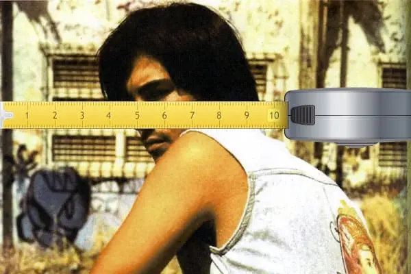
A member of a facebook group I follow asked “What is the ideal image specs for a full width revolution slider? I need to provide this to my client so he may source images for the new site I am building for him.” A simple question that has a simple answer but some underlying information […]
Whitespace
In the current online social media driven environment we are surrounded by information. This makes it vital for designers to think about and be clear with their layouts. The pages we design must get viewers’ attention regardless of whether they are buy goods on an ecommerce site, reading a blog or browsing a news site. […]
Colour Wheel
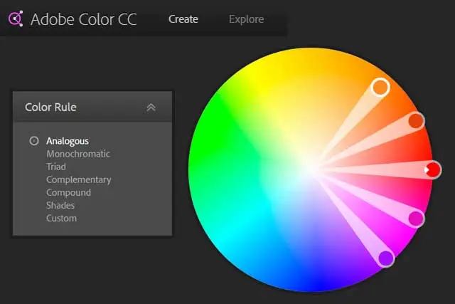
Adobe Color Wheel Pick a Color any colour – no not that one! I was part of a discussion the other day where someone’s site design was called into question and part of that was the colour scheme. Some would say that the colour scheme was somewhat bland but the subject matter of the site […]
Typography
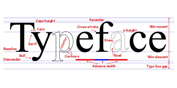
Why all capitals is not a good idea On many web sites the designer has chosen to use all capitals to promote an important message but all capitals is not a good idea. When we read we actually read the white space around words as much as we do the words themselves and this ability […]
Accelerated Mobile Pages
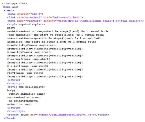
The Accelerated Mobile Pages (AMP) Project is an open source initiative that is being driven by publishers and technology companies to improve the entire mobile content infrastructure for everyone: publishers, consumer platforms, creators, and users. In an April 1st post on the ampproject.org website a comparison was drawn between the Very Large Mobile Page Accelerator and the […]
Brand Assets

Brand Support The whole point of a “Brand” is to promote consumer recognition and usually some “brand value” but we’ll leave out the marketing clichés and concentrate on the brand image. The key to promoting and maintaining a brand is having a consistent use of that brand in all media including shape, colour, size and […]
Aspect Ratios
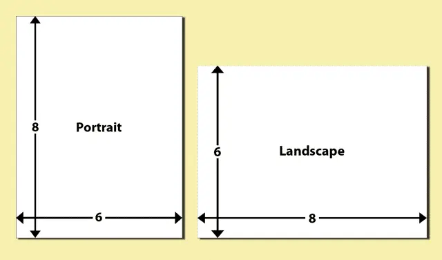
When we look at pictures and images they are either a portrait image where the width is narrower than the height dimension or they are landscape where the height is less than the width. These descriptions and width: height relationships began with paintings and spread through into photography in a sort of “if it’s not […]
Image Tools

Image Tools To create your perfect website you need to be able to manipulate images and graphics to get them into the right size and format. Probably the best now tools for this are the Adobe Suite of programs with Photoshop for images and Illustrator for vector graphics. The programmes are unfortunately far from cheap […]
Image Typefaces and Fonts

When you have been employed to create a new version of an existing website try and get the highest quality graphics you can direct from the client. By all means use images from their existing site (if they have one) as “place holders” but try for the originals. If you are adding any additional drawn […]
Image File Sizes

It can sometimes be difficult to find just the right images for the message you want to convey on your site. But please don’t steal images from the other peoples websites. Sourcing Images There are many sources of free images out there so have a search for for something suitable. When you do make Google’s […]
