
Image Typefaces and Fonts
Typeface or Font
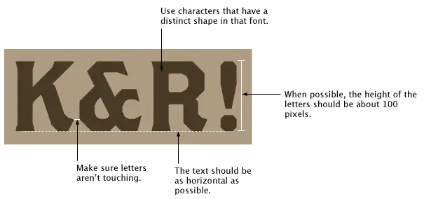
Finding the Font
Using an Image
Font Identifier
If the text on the image you have isn’t clear enough for “WhatTheFont” all is not lost you can try using Identifont Fonts by Appearance http://www.identifont.com/identify.html. You can just leap in and answer the questions but it is better if you can limit the search by selecting the character from the alphabet that appear in the word or words you are looking for. If the first run through doesn’t give you a close result re-evaluate based on the questions asked which letters to use in the applied filter. This tool may not give you the exact answer but it gives you a start and you can look for fonts similar to the ones suggested.
Has it been tampered with?
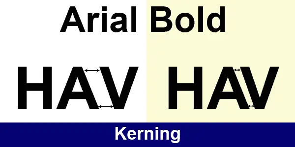
The final question is has the font that is the same in most of its attributes been “adjusted” by changing the “Kerning” or “Tracking”, by changing the vertical or horizontal scale or simply by “transformation” in an image program. Transformation will have a similar effect to changing the scale but may not scale things evenly and lead to some odd distortions.
Kerning
Kerning adjusts spacing, that is the distance between two letters. If letters are set too closely together then they can become indecipherable; set too far apart, on the other hand, and they’re awkward to read. Even worse is if some letters have wider spacing than others, then it can be frustrating for someone to read without them fully understanding what’s wrong. It may be used for effect, however, in some logos to place two letters in a name unusually close together for emphasis and may also include changing the colour of those two letters.
Tracking and kerning are often confused with each other, but the concept of tracking is a little different. Tracking adjusts the spacing throughout the entire word to which it is applied and tracking can be used, with great restraint, to change the spacing equally between every letter at once.
Tracking is can be used to make a single word seem airy and impressive or it’s most common use in graphic design particularly in logos is to balance words of different numbers of characters with a different “natural” appearance due to the character content. In the example below “Hello World” bot words contain the same number of characters but “Hello” is naturally narrower. By applying expanded tracking “Hello” can be made to be the same width as “World” and therefore more balanced. Tracking can be either positive, adding more space between characters or negative reducing the space. Tracking can be very useful when aligning two words on an image where one is a small word in a large font size and the other is a long word in a smaller font size.
Tracking
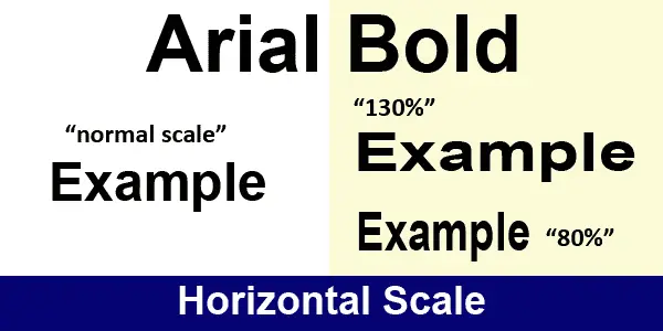
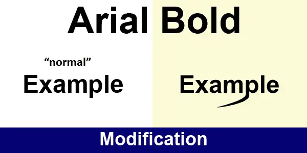
A font can also be modified by altering the vertical scale of the characters either to either make then taller than “normal” or shorter, or by changing the horizontal scale to make the characters thinner or thicker.
Text Scale
And finally customisation
Recent Comments