

Website On a Screen
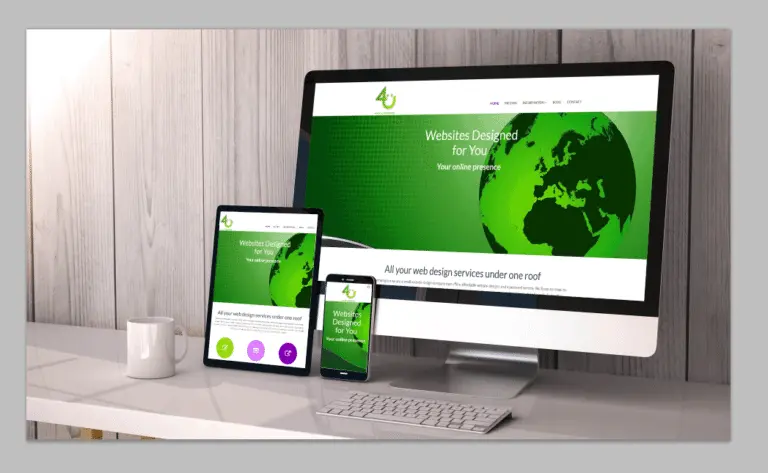
Tutorial for easily adding a Website Image to a Device Screen
You often need to show what something would look like in a real wolrd environment and whilst there are tools available online they often come with the hassle of registration. The method show here shows you an easy way for you to add what you want to whatever you want.
Instructions for Photoshop
Find an image that you want to use to show a website in use. Remember don’t steal copyrighted images there are a lot of free ones available.
Load the image into Photoshop and “unlock” it.
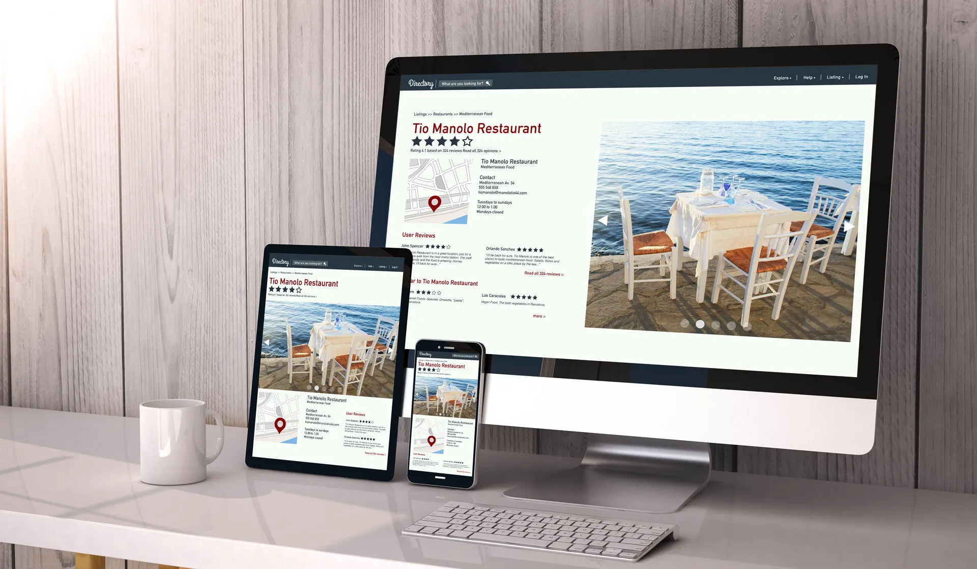
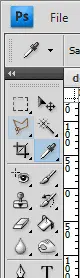
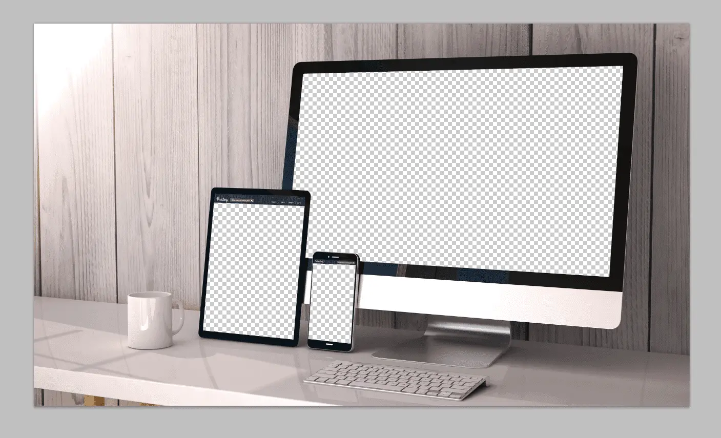
Select the “Polygonal Lasso Tool” and on each of the device screens click in each corner and when completes click “delete” to remove the content. Some images you choose may just be three rectangles to remove others, like the one I selected, may be more complex.

You will then have an image with 3 holes in. Open the three images you will be using to represent a phone, a tablet and a desktop. Then transfer each of there images to new layers on your main image.
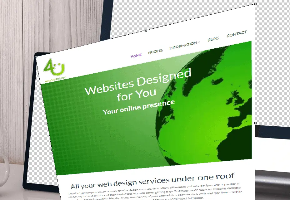
Select the mobile phone image and choose “Edit>Free transform”. With the Control key held down select one corner and drag it to the matching corner of the device you are currently “creating”. Move each point to little wider than the screen and then press enter to accept the transformation and move the layer below the main image.

When you have done all three images you should have a finished show case. I recommend saving this as a tiff file because it preserves the layer and allows you to reuse the “main image” for a different website. Save as a jpeg for use on you website.
Recent Comments