

Whitespace
In the current online social media driven environment we are surrounded by information. This makes it vital for designers to think about and be clear with their layouts. The pages we design must get viewers’ attention regardless of whether they are buy goods on an ecommerce site, reading a blog or browsing a news site. The design must be readable, easy to understand and easy to like.
Page design falls into the old adage “KIS” Keep It Simple (or KISS keep it simple stupid) because a simple layout rather than a complex one is going to keep readers interested. An eclectic mixture of a lot of elements, images, colours and different shapes on a page will make your site look more like an “infomercial” and may cause visitors to leave because they aren’t comfortable.
Key to delivering an enjoyable and engaging on a web site is an understanding of “whitespace” and how that can be used to create simple and elegant designs. It is surprisingly important in web design as you can use it to improve readability and web site performance. Additionally whitespace is part of the old “less is more” and “make it simple” mantras that are proven and effective in designing web sites.
Whitespace is an old printers’ term and does not have to be white in colour and there are some very simple ways of explaining what whitespace is, but one is a quote from Mark Boulton’s Whitespace article: “whitespace is empty space.”
What is Whitespace?
Whitespace, sometimes times referred to as negative space, is that part of a page left unmarked, the parts are that left blank, or as the quote above says the empty space in a page. It’s the space between graphics, columns, images, text, margins and other elements in web site design. Whitespace are the spaces left untouched that will smooth things out and transform a page into something elegant. Blank space also reminds that we don’t need to create layouts filled with text and graphical elements to communicate a clear and direct message; that simpler designs are beautiful. Whitespace is associated with elegance and sophistication, it is a way to organise text and elements to guide visitors’ attention to particular on page elements.
An example, that we are all familiar with, of the great usage of whitespace is Google. Their homepage is filled with whitespace so we can focus on what is important: search.

You need to think about every detail of a page; to decide how to include more whitespace in your designs and deliver a better result. This includes margins, header, footer, menus, images and captions, items in a list, words and letters. Keep in mind that you want to create something elegant and clear while improving user experience by thinking about all of these elements and start leaving more space between them. Creating a good user experience means having space to breathe between elements and letting your readers’ eyes relax. Using 11px text and cramming it into the bottom of a page won’t deliver the a good user experience your visitors’ desire.
How to Use Whitespace
Below is an example that shows the difference in using a direct mail piece. As can be seen by increasing the whitespace the image is changed from “in your face” to something simple and elegant.

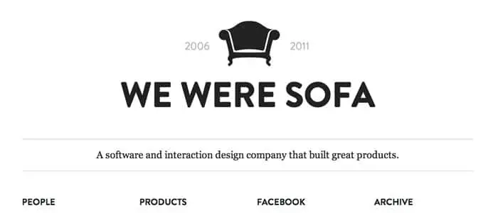
Another interesting example of the use of whitespace is the Made by Sofa web site that commands attention through its simple and clear design. The layout demonstrates that you can get a good result by tastefully positioning elements while leaving blank space between them.
A Designer’s Goal
When designing for the web the thing to remember is that you always want to deliver your clients a great product. The proper use whitespace will give your client’s readers the best user experience so that they keep coming back to the site. If the it is an e-commerce site, users need to be able to navigate around the site easily so they are able to keep buying products.
On a blog or news website, users need to enjoy reading the content so they can browse the articles without leaving the page. It doesn’t matter on the type of content the web site has, you need to use whitespace to keep the navigation clear and smooth and to make sure the users’ experience continues to “flow”.
Your main goal should be to make the web site look simple; to un-clutter the visual frenzy that often pollutes sites. You need to develop layouts that make people want to keep reading because they are easy on the eyes. As a designer even if the task of creating something simple is very complex; you need to create simple designs.
Use whitespace wisely to improve your designs because to make text readable you need more space between letters and headers. Instead of stacking tons of information to use up all of the space you have, you can have two or three nicely spaced columns showcasing only what is truly important to the readers.
Conclusion
I believe that the approach you should take, in using whitespace, is to think about what you would like to see on a page. Would you like to read, for example, something that is squeezed onto the page or would you rather read something that is well-spaced? Will your readers want several different kinds of information taking up the whole page or would they rather have something that is properly organized?
Focusing on improving user experience and content is always the way to go when designing a web site. The effective use of whitespace will certainly help you deliver the experience that your client’s readers will enjoy and that usually leaves your client happy with the work you’ve done.
If you are interested
Recent Comments