

Typography
Why all capitals is not a good idea
On many web sites the designer has chosen to use all capitals to promote an important message but all capitals is not a good idea. When we read we actually read the white space around words as much as we do the words themselves and this ability is severely reduced with all capitals. Increased difficulty in reading and understanding drastically reduces the effectiveness of your message.
When you started to read you had to sound out the letters or phonics (whichever method you learned by) but when was the last time you did that? It was probably an unusual name or technical term that you may have heard but not seen written down so you had no idea what it looked like – what its “shape” was. We marvel at how anyone can read Chinese but actually they are just “word shapes” many of them very complex but so it the word shape of paranormality but you can read it.
Your brain is an extremely powerful processor particularly with shapes (we see them everywhere; in clouds, in patterns on the floor) and we use that shape recognition without realising it:
For emaxlpe, it deson’t mttaer in waht oredr the ltteers in a wrod aepapr, the olny iprmoatnt tihng is taht the frist and lsat ltteer are in the rghit pcale. The rset can be a toatl mses and you can sitll raed it wouthit pobelrm.
It even works when we replace letters with numbers (it works best with capitals):
S1M1L4RLY, Y0UR M1ND 15 R34D1NG 7H15 4U70M471C4LLY W17H0U7 3V3N 7H1NK1NG 4B0U7 17.
But I suggest the jumbled mixed case was easier to decipher that the all capitals but why is that?
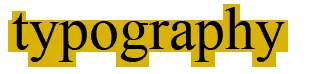
If we look a word – let’s say typography and the “shape” it makes:
Then we look at a jumbled version but with the first and last letters in their correct places:
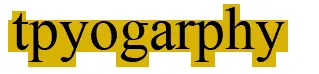
We can see that the “shape” of the word is the same and this is why we can quite quickly read what it is. But if we don’t obey the first and last letter rule:

We can see that it is a different shape, what we’ve got now is an anagram to solve.
A large part of this recognition comes from the top half of letters because in English the top half of words varies more that the bottom half:
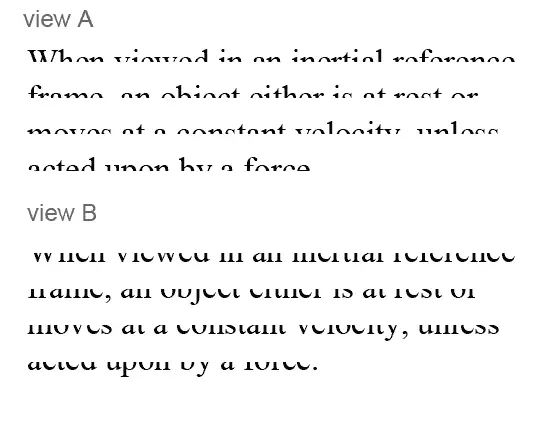
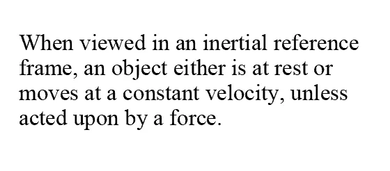
Now I’m pretty sure you were able to manage to read view A better than view B if you could read B at all. If you didn’t get it all it’s:
So if we rely quite heavily on the variation of the top half of letters for our reading and therefore understanding it follows it we take that variation away text becomes harder to read and understand.
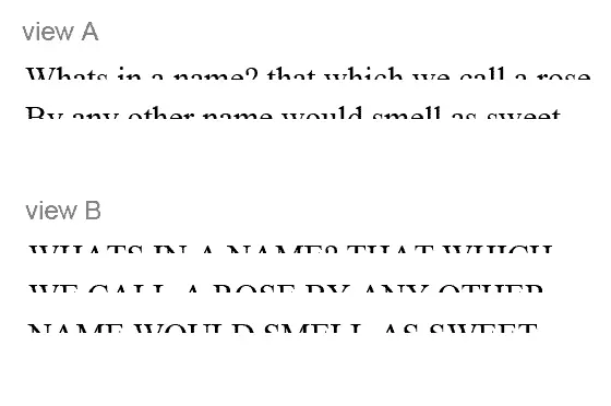
View A is still readable but view B is very difficult to decipher – “What’s in a name? that which we call a rose, By any other name would smell as sweet.”
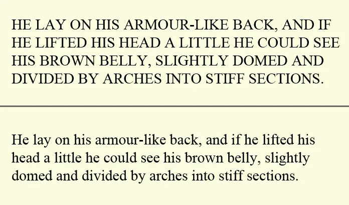
Using all capitals adversely affects our ability to read and understand content. Of the two paragraphs below which can you read more easily – mixed case or all capitals?
So the message is clear use ALL CAPITALS sparingly if at all and only for a small number of words not whole blocks of text. The easier your visitor can read your message the more they will understand but if the text is hard to read “click” and they are gone!
Recent Comments