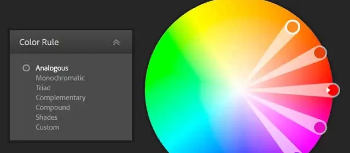
Colour Wheel
Adobe Color Wheel
Pick a Color any colour – no not that one!
I was part of a discussion the other day where someone’s site design was called into question and part of that was the colour scheme. Some would say that the colour scheme was somewhat bland but the subject matter of the site meant that an “In your face” colour scheme would have been inappropriate. As a designer you are often between a rock and a hard place; you can build what you think is a beautiful website and the client hates it or you build a website you think is terrible and client will loves it. Often the customer is always right – even when they are wrong. This got me thinking about colour schemes.
Now it is a general rule of thumb that guys are just not as good with colours as the girls are (there are exceptions both ways). I mean guys have less than ten names for colours girls have hundreds. So what do we do when we are trying to choose the colour scheme for a site? It depends whether the client has anything that already promotes his “brand” for example a logo on their truck, their store front or a business card. This will give you a starting point; in looking at a tool for selecting colours there is an option to look at colour combinations if you are starting from scratch and some design tools include the same sort of “swatches”.
The free tool that I use is Adobe Color CC https://color.adobe.com/create/color-wheel. On the Explore tab there are hundreds of colour swatches that you could ask your client to have look through and choose one they like or one that’s close to what they like that you can fine tune to their taste. Notice I say their taste you might hate it BUT they are the client so they are right.
One thing you have to make clear to a client is that where colour is concerned what they see is not necessarily what everyone else gets. In the print world there is the Pantone Color Matching System (PMS) that is largely a standardized colour reproduction system. By standardizing the colours, different manufacturers in different locations can all refer to the Pantone system to make sure colours match without direct contact with one another. So I can commission some printing from the UK to suppliers in New Zealand and Japan stating that background colour will be Honeysuckle Pantone 18-2120 and I will get the same colour from both printers.
If only the world of screens was as standardized! Unless your screen has been chromatically calibrated or calibrated at all there will be a wide variation in the colour pallet you see on your screen. Even if you have calibrated it yourself peoples’ eyes sure aren’t standard and what you see as perfect may to me have a blue cast or tint. Then throw into the mix different screen manufactures, different device types, different screen drivers and the fact that in print we take colour away and on a screen we add it and you end up with the TV colour standard NTSC – Never The Same Colour twice.
If a client has print collateral and the printer can tell you what pantones he used you can work back to the hex colour codes for the web but these are unlikely to exactly the same as the print colour. In the past web site designers were limited to “web safe colours”. Web Safe, or Browser Safe palettes as they are also referred to, consist of 216 colours that display solid, non-dithered, and consistent on any computer monitor, or web browser, capable of displaying at least 8-bitcolor (256 colours). Today, however, you can define (in CSS) 256 shades of red, 256 shades of green, and 256 shades of blue which, when combined, allows for 256 cubed (16,777,216) colours. In most cases, there is no reason to limit yourself to the 216 web safe colours since modern systems support and render these approx. 16 million colours in a relatively similar, although not in exactly the same, manner!
With Adobe’s Color CC colour wheel you can start with the client primary colour (the arm with the white chevron in) and set that colour then experiment with the types of colour combination to find something pleasing. If the site is about grass you might want a monochromatic set of colours (all green) a street art site may demand a more garish combination. The colour wheel gives you a chance to create your pallet before getting too far into building the site.
My tip – having chosen the pallet make a swatch in a drawing package (Photoshop or GIMP) with a square of the colour and its parameters in hex and RGB. It will prove invaluable later.


Recent Comments