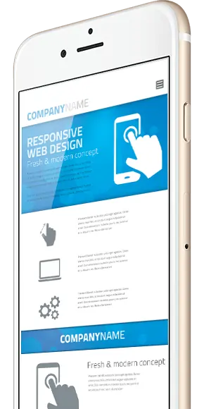
Google indexing content using the mobile-first indexing procedure results in over half of the pages shown in search results globally. What does that mean -it means that it is far more likely that the pages presented on, a Google search, are based on how that content was crawled and indexed by Google based on the mobile version of that page.
Mobile-first indexing is simply how Google crawls and indexes the web. Google looks at the mobile version of the page instead of looking at the desktop version. In even more simple terms, Google is ranking your web page based on how it looks on a mobile phone versus a desktop computer.
It’s pretty simple if your site is not mobile responsive it will appear in searches after every site that is. Today, it is even more important that your site is designed to work on a mobile phone.
Most websites that are built today should have a “mobile responsive” layout that will make your website be visible and useable on devices other than PCs and Laptops. Your site will be useable on tablets and smartphones but for some people, this does not produce the best results. You may be presented with the whole of your website on a mobile phone but to use it you have to scroll down and down to see the whole page as a very, very long and thin page. Not always the most user-friendly of presentations.
You have taken the trouble to create a rich and informative website that then gets condensed into something that is really unusable. If you are running, for example, a restaurant you need to consider what a mobile phone user wants from your website. They want a limited amount of information and they want it now! They do not want to swipe down and down your website looking for your phone number. They want to quickly find out when you are open. They want a website that is constructed specifically for mobile phones.

Figures from Google show that 40 per cent of mobile phone users will leave a page if it does not load within 3 seconds, To combat this Google has created an open-source technology Accelerated Mobile Pages (AMP).
By using this new technique it is possible to provide content rapidly on mobile devices. Google wants to ensure that page load speed is increased on mobile devices.
If you would like to know more then click on this AMP information link or if you are on a mobile get the AMP version of the page. If you need to deliver information fast to your customers’ Websites Designed 4U is committed to using all the tools available to achieve that for you.
